


COMPANY
HOME COMPANY CI
CI
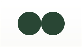
Our company logo design starts with imagining two people face to face as if engaged in a heartfelt conversation. This motif representing an intimate connection is the basis for the INBETWEEN icon in which we tried to capture our vision to be the “Connecting bridge between brands and customers and between our partners and the KDF market”
-

people face to face
-
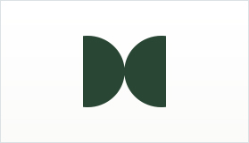
one connection / unity
-
stylized motif
-
INBETWEEN
Connection for us is synonymous with ‘Unity’, as by connecting with our partners and KDF operators INBETWEEN believes that we come to share our goals for success but also a resilient trust and respect for each other, wishing and aiming for mutual progress and reward. In designing our company logo, we tried to draw out some of these ideas, by starting with two people facing each other and connecting. Hopefully we arrived at a design that can express our core aspirations.
CI Download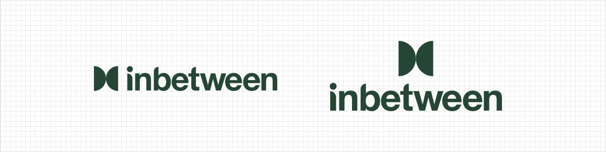
-
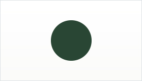
HEX #294634 CMYK 64 / 62 / 82 / 37 PANTONE 553C -
HEX #FAEEDE CMYK 2 / 9 / 14 / 0